Rebrand: Whiskas
Challenge: Re-design whiskas cat food with something unique and playful.
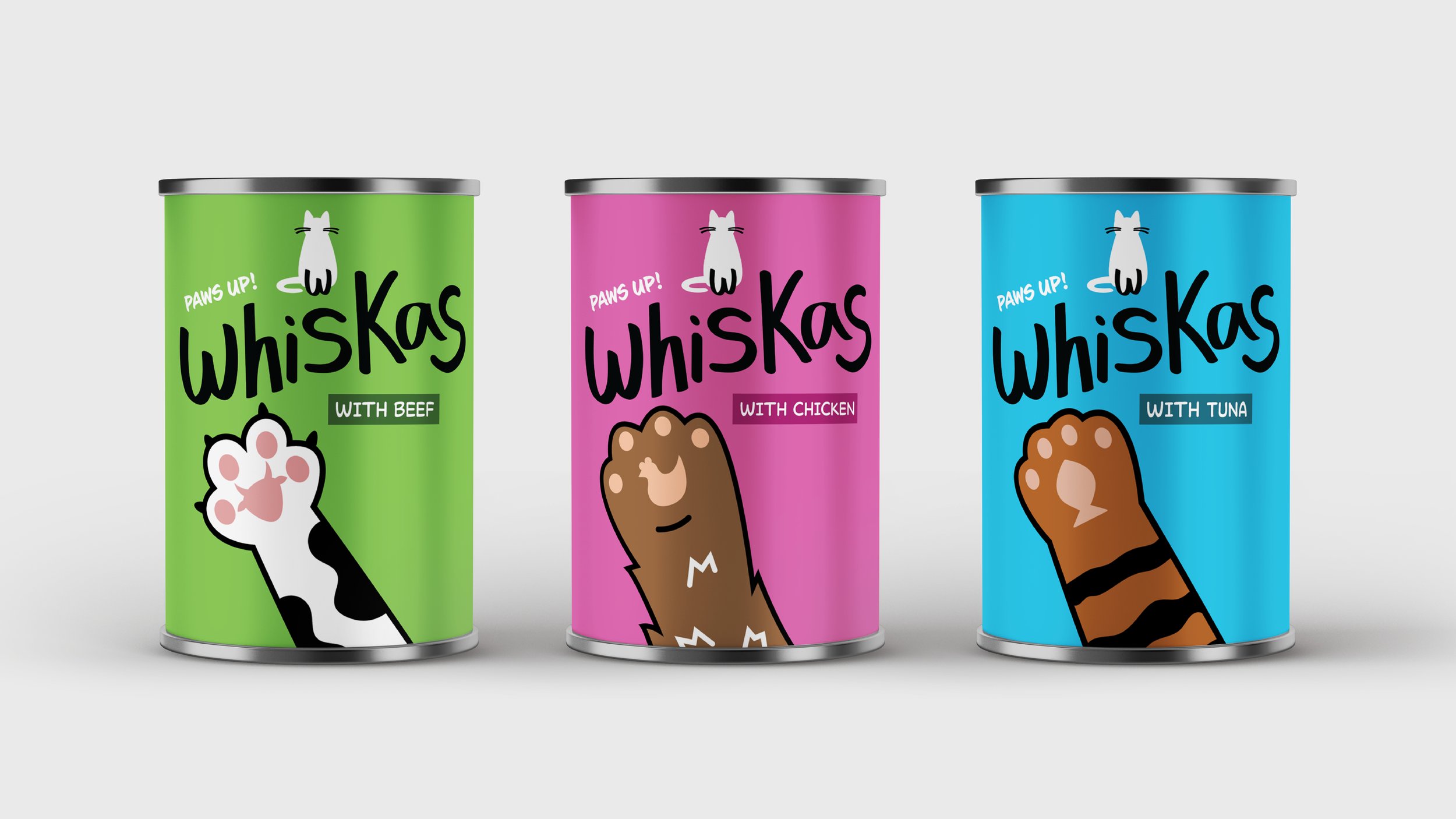
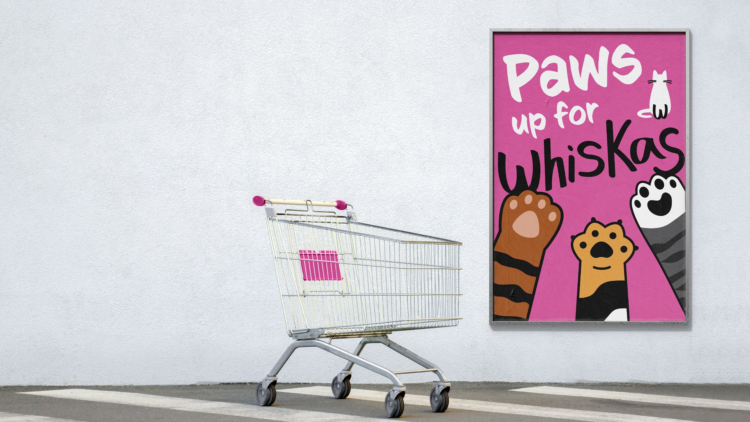
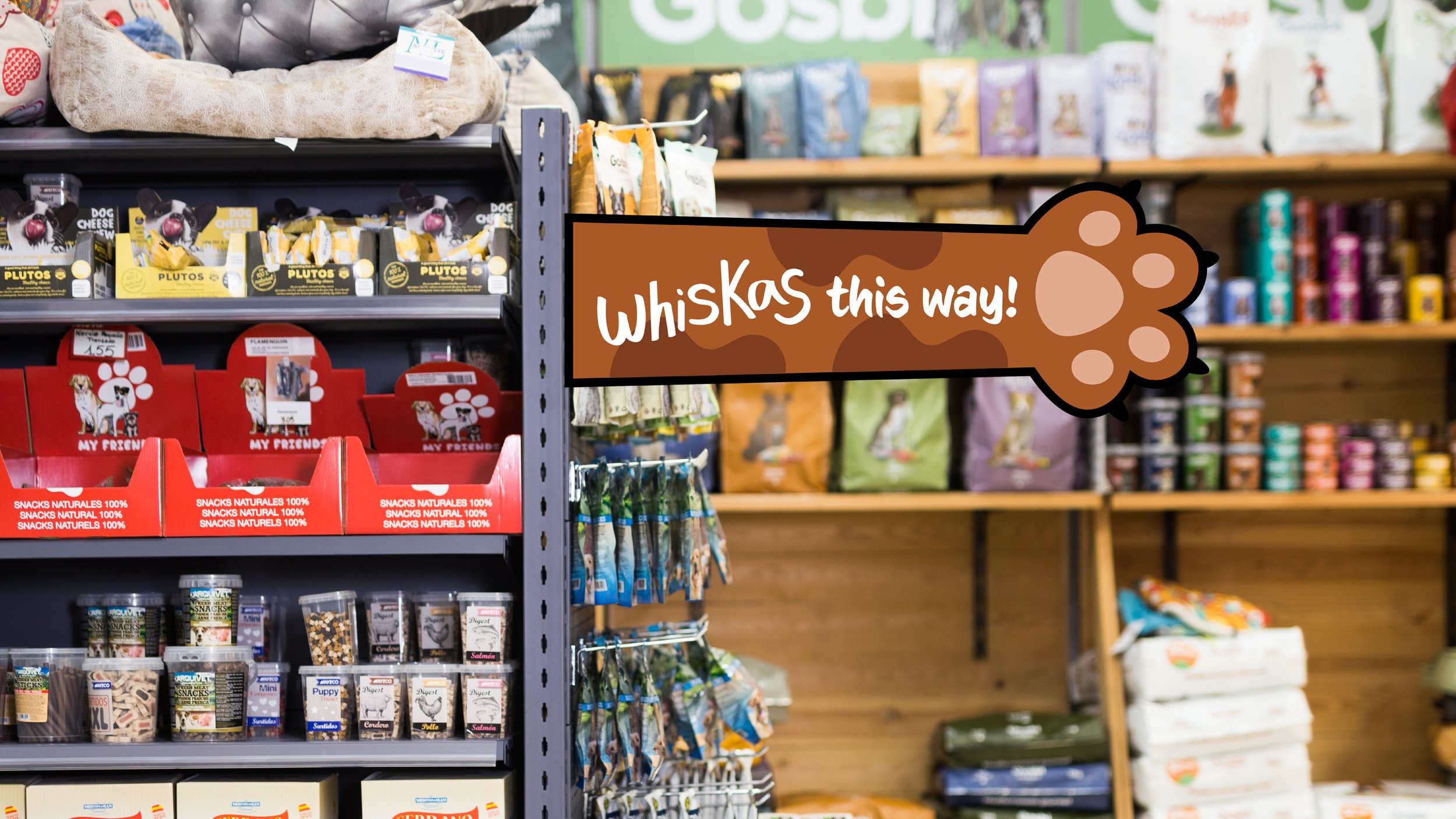
Solution: The rebrand features a custom hand-drawn typeface designed to reflect the playful nature of the brand. The 'W' from Whiskas is incorporated into the logo as paw shapes, creating a cohesive and distinctive visual identity. The paw element is extended to the packaging, where paw illustrations appear on the cans alongside the slogan 'Paws Up!'—emphasising how much cats adore Whiskas.